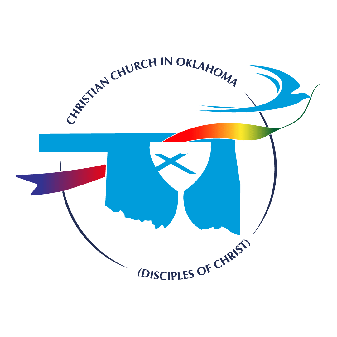
Welcome to 2023! The Regional Church has adopted a new and fresh logo and we want to explain its meaning.
While the State of Oklahoma continues to symbolize the Oklahoma Regional Church, it is now encased in a circle, representing the liturgical calendar, or the circle of life, or the world.
The Disciples of Christ chalice symbolizes Jesus’ invitation to all to come feast at the table of grace and forgiveness, and our covenant with one another love all of God’s creation and to do this ministry to which we are called together. It also represents a symbol of unity amidst diversity.
The colored ribbon or sash, carried through the chalice and throughout the state, symbolizes the story of the church through the liturgical seasons of the church year: purple for the seasons of “preparation”, white/gold for the “high holy days” at Christmas and Easter, red for “Pentecost” or moments where the Holy Spirit moves, and green for “ordinary time.”
The scissortail symbolizes both Oklahoma as well as a spreader of song and peace throughout Oklahoma and beyond into the world.
Our new logo was designed by Imagist Ink, owned by an Oklahoma Disciples of Christ member, Jamie Bramble, from Simplicity Church in Oklahoma City.
This logo is more colorful than our previous logo, and it is designed to tell a story. You will see this new logo on our website, the Regional Roundup, OK letterhead, and even on Clergy Standing Cards!


